One Tap Away
One Tap Away is a startup making life at multifamily properties simpler for both residents and property managers.
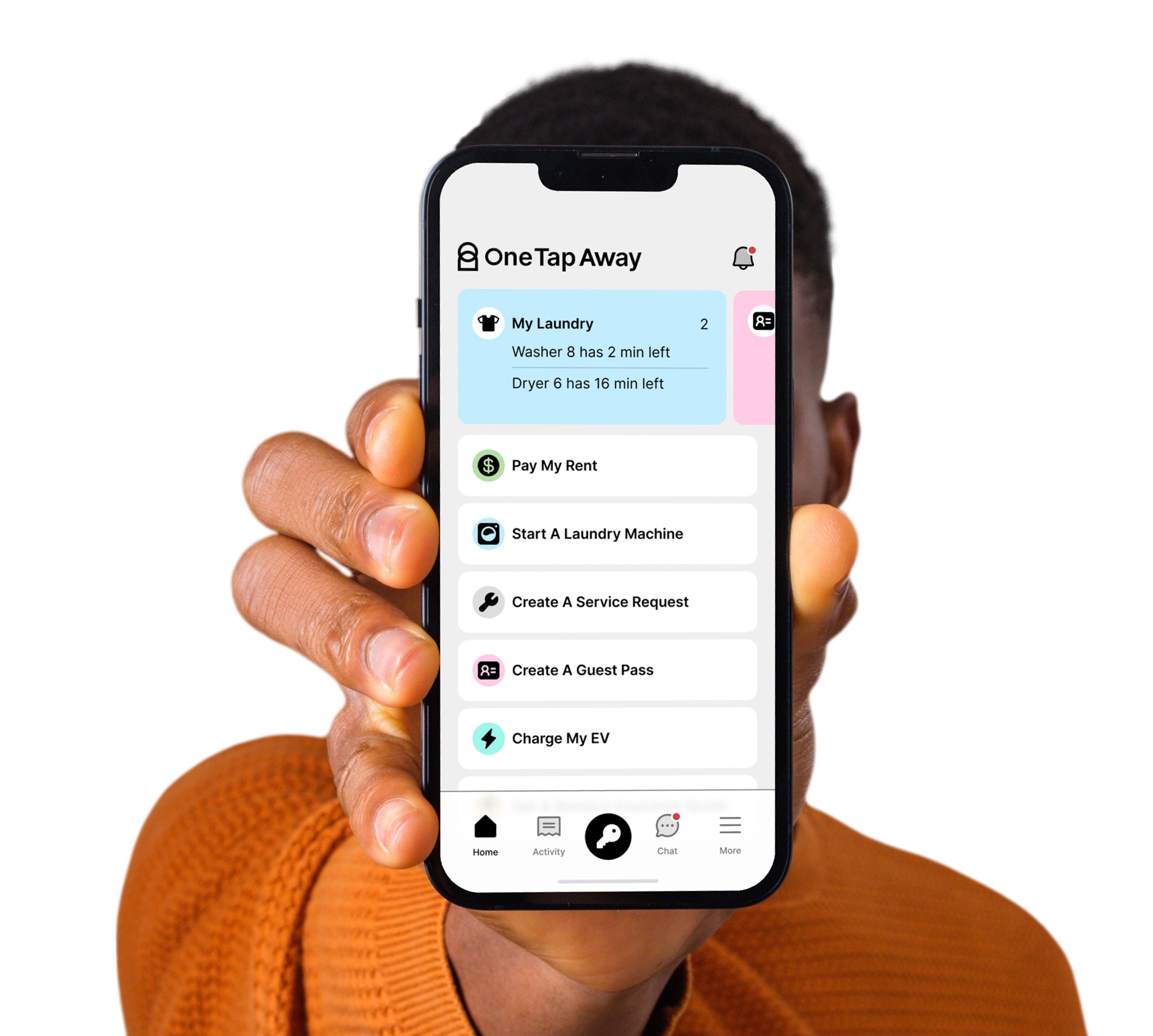
I joined the OTA team in 2021 to help them create an experience that would deliver a growing suite of amenities at a variety of properties across the US.
The Identity
The One Tap Away identity is inspired by the concept of a basic human interaction with technology to accomplish a task. Like an "easy" button for residents.
A question we continued to ask ourselves when creating the different amenity flows was:
"How can we (as OTA) be the way things get done without getting in the way?"

Iconography & Color
Each amenity has it's own icon and unique color.
This allowed us to establish consistency on the app's main page while also branding the individual amenity flows.
Keyless Access
Rent Payments
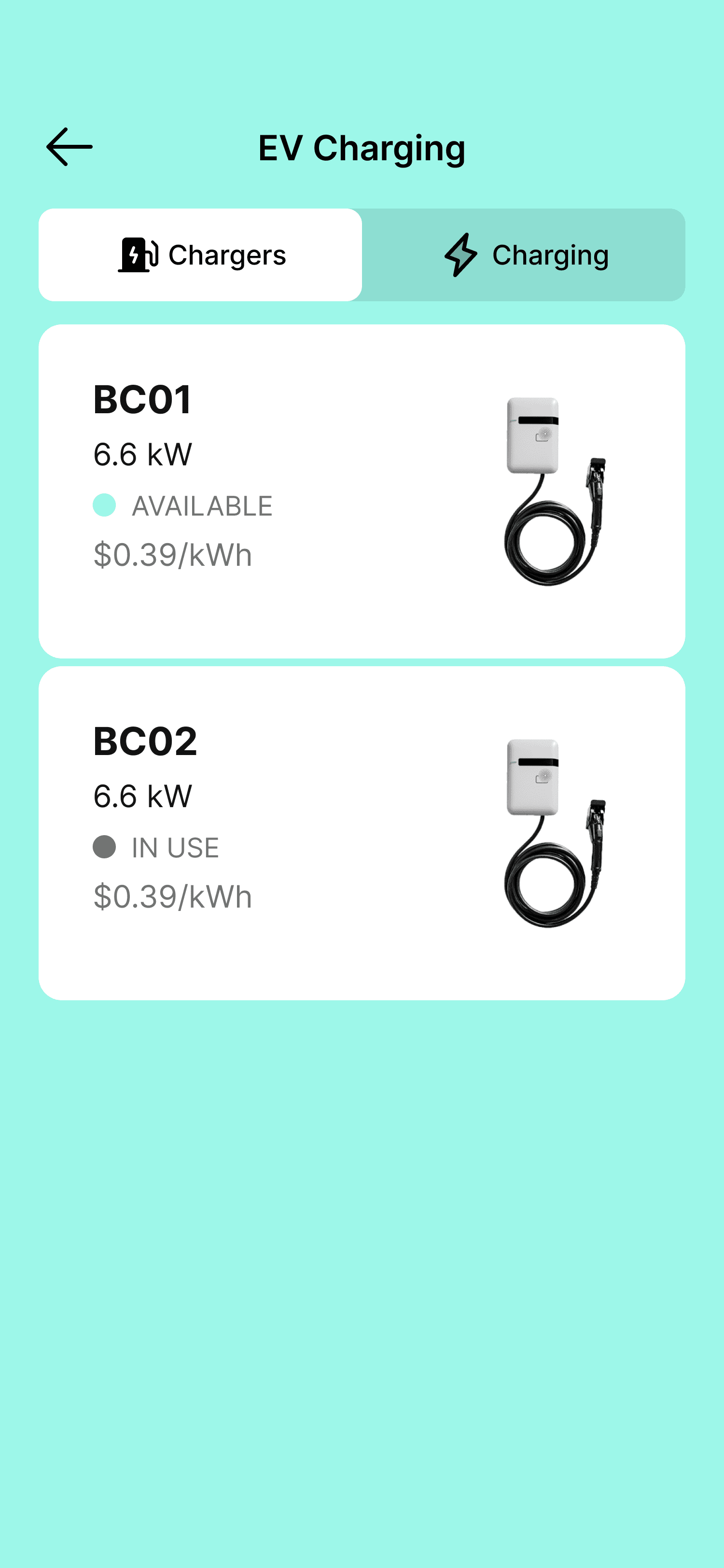
EV Charging
Renter's Insurance
Packages
Bookings
Guest Passes
Lease Renewals
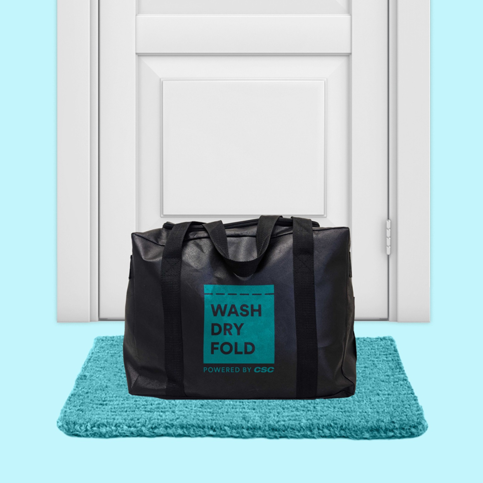
Laundry
Service Requests
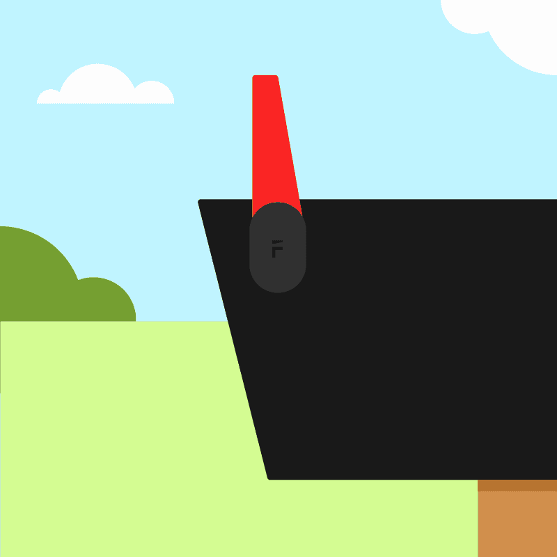
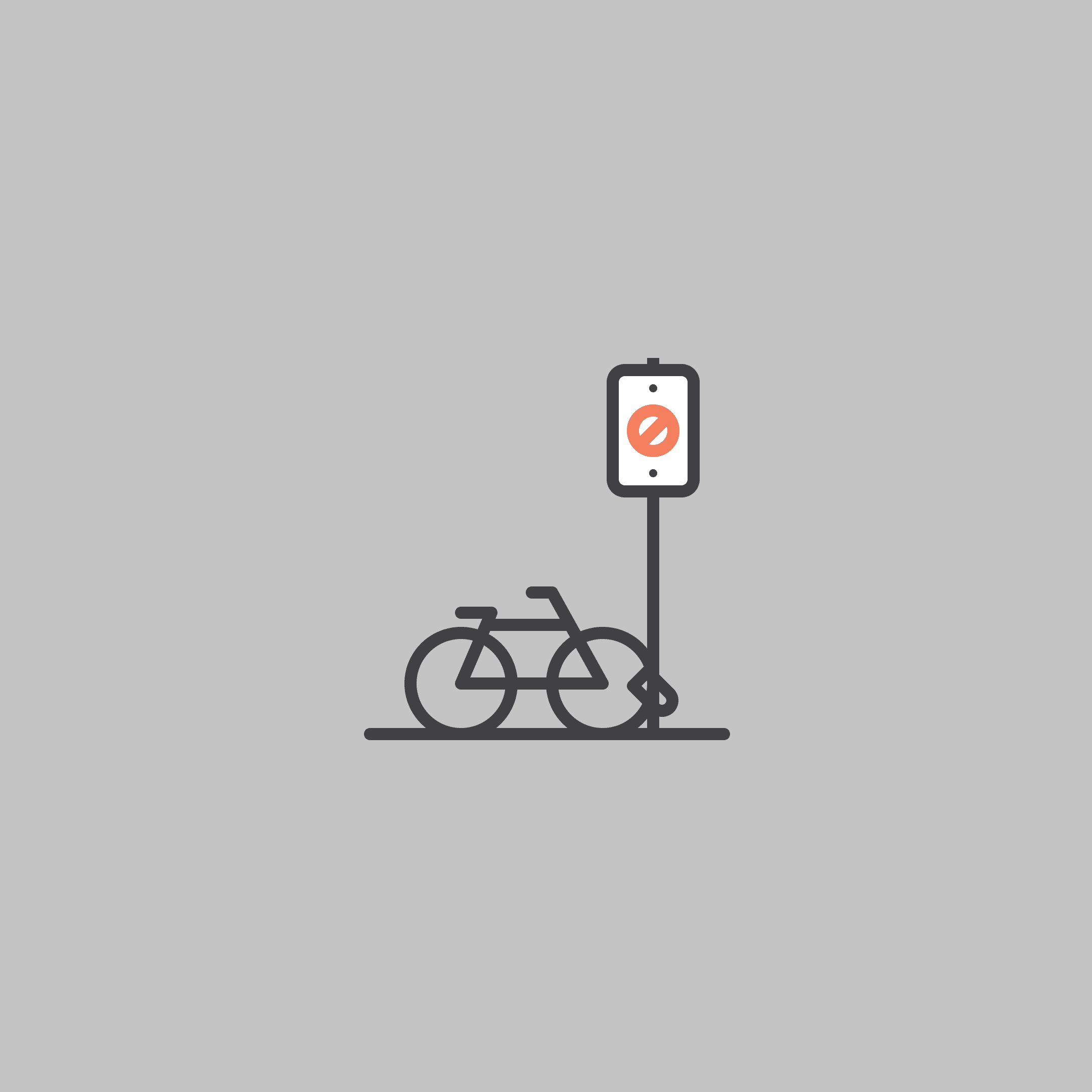
Illustration
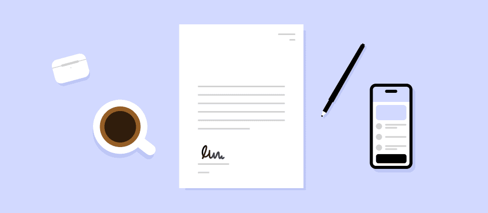
If it didn't illustrate the topic, point, or concept, we didn't illustrate it.
Our illustration style was a natural extension of our color palette with an emphasis on simplicity and minimalism. Creating these was one of my favorite parts of the project.



All together now
A collection of screens showcasing the various elements coming together to create a unified look and feel across a variety of pages.